It's Not A False Equivalence
05/01/21 07:37 Filed in: Ruminations
Often, when I counter someone's argument that X party is awful with saying both are shit, I will get a screed (long or short) about how it's a false equivalence because [*insert bullshit about party X or Y*].
Well, here's why it's not a false equivalence.
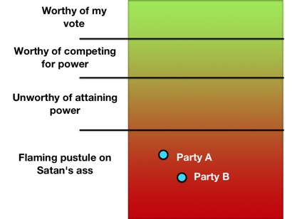
Well, here's why it's not a false equivalence.
How the US Can Go Metric
01/01/21 08:17 Filed in: Ruminations
 Here, in the U.S., we're one of just a few countries that are still using the Imperial measurement system, one that isn't exactly consistent across borders. That we're not all-in on the metric system here in 2021 is silly. We even have muppets like Tucker Carlson who attribute the Metric system to some "creepy new world order." Congress passed a law in 1975 to get this country over to the Metric system. The problem is, however, that it's voluntary. While there is a regulation in place to require agencies to use the Metric system, it lacks teeth. So, why can't we just switch to an objectively easier system?
We're Already Using Metric Measurements
While many Americans hold on to the system they've always used out of fear of what's different, much like how they resist something as simple as wearing a mask to protect others from COVID-19, they're already using the Metric system in their day-to-day life.
Those guys boasting about "resisting the mask Nazis" as they stand by their over-sized grocery-getting pickup trucks compare engines using Liters (Metric!). In among their groceries are packages that have Imperial and Metric measurements side-by-side. Even more explicitly, they bought 2-Liter bottles of fizzy sugar water (soda). When they get home, after drinking their fizzy sugar water, they take their diabetes medication measured out, you guessed it, with the Metric system. Anyone (not those guys) who's participated in Track events in high school or college used the metric system. Those running events are measured in Meters. Casual runners and walkers doing 5Ks? Kilometers. Scientists in the U.S.? They're using the Metric system.
Finishing the Conversion Would Be Easier Than You Think
Take a look at the image to the right. It has two roughly equivalent speed limit signs, one in MPH and the other in kph. The second one doesn't even need the "km/h" under the number. The red circle is an international standard indicating a restriction. Adding the Metric speed limit sign should be done immediately. It allows people whose cars are showing Imperial measurements to understand how fast they're going relative to the speed limit while the conversion moves forward. At the same time, new cars should be sold displaying vehicle speed in kph by default and as the most prominent vs any side-by-side mph display. People driving older vehicles would use the upper speed limit sign while those driving newer vehicles would use the lower. The diferently-designed signs have the added benefit of avoiding confusion. Do I drive 40 mph or 60 mph? Highway signs showing distances should also be modified to show both miles and kilometers. While we're at it, stop teaching the Imperial system in grade school. Full stop.
Five years later: remove all Imperial measurements from new vehicles. Metric only.
Ten years on: remove all Imperial measurements from road signs.
How easy would it be for Americans to mentally make the switch? It would be easier than you think. When I was in France, we got around by car. Driving and obeying the speed limit was not difficult. The signs said the speed limit was 110 kph. The car showed the speed in kph. Anyone who can't do the same needs their license revoked.
What the Pandemic of 2020 Has Taught Me
02/12/20 22:00 Filed in: Ruminations
The COVID-19 pandemic and our fellow members of society's response to it has taught me a lot about the human condition. As a species, we are not well.
With the exception of #8, all the above is bullshit. However, it's what American society seems to hold as its values today. We are not well.
- You only need a high school diploma to be a greater expert on epidemiological matters than actual epidemiologists, complete with their education and degrees. Those socially promoted to a diploma are apparently acceptable as well.
- Wearing a mask to protect others is a violation of our constitutional rights while apparently, being forced to wear a shirt and shoes into a restaurant is not.
- It's not only OK to get others sick, whether it's COVID-19, the flu, or the common cold, it's apparently, our God-given right to do so.
- The inconvenience of being kept from your weekly consumption of 3,000 calories inside Applebee's is a violation of our Constitutional rights and no manner of human suffering, death, or overwhelmed hospitals can justify it.
- Data presented by experts must be not only questioned, but disbelieved. Data presented by TV & radio talking heads and bloggers/vloggers can be trusted without question.
- In spite of the CDC and the Surgeon General explaining from the very day they recommended face masks that the primary purpose and benefit is to protect others from us, the wearer, we must make this about ourselves. We must keep framing our arguments around its benefit or lack there-of to us, the wearer. Altruism is for suckers.
- High school sports must go on, no matter how many people end up in the hospital and/or die. It's our dream that our kids grow up to be like Al Bundy.
- There is a direct correlation between loudmouths driving over-sized penis compensators and emotional fragility experienced when having to wear a piece of cloth over the nose and mouth.
With the exception of #8, all the above is bullshit. However, it's what American society seems to hold as its values today. We are not well.
Getting Close
08/07/19 12:42 Filed in: Bike Builds
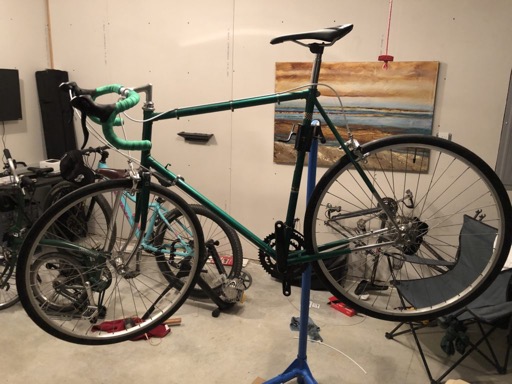
Brakes are connected and working. Shifters are installed and the new bar tape has been installed as well. The front derailleur and the cable guides are installed. As you can see, I went with white for the cable housing, in keeping with the original look. I hope to give it a test ride within a week. I just have the chain, pedals, and hook-up of the rear derailleur to do.